

Issue 54. Navigation fundamentals for graphic recorders
A newsletter for graphic recorders, live illustrators and sketchnoters. In this issue: wayfinding, New Year intentions and your annual pen check

Hi - I’m Cara, I’ve been a professional Graphic Recorder and business illustrator since 2006.
You’re reading the Visual Edit, a free newsletter for graphic recorders, live illustrators, sketchnoters and business illustrators. Upgrade to paid and join me in the graphic recorder club for Draw a Better Business posts and podcast extras.

Navigation fundamentals
In the last episode of the graphic recorder club podcast we talked about how to make sure your visuals make sense, and if it really matters if they don’t?
Now making sense will mean different things to different people but even if you’re clear on what sense you’re trying to make it’s not always an easy thing to achieve.
One thing I think we can agree on is that part of making sense, an important part, is understanding the art of navigation. How do people move around your page, how do they know the direction to look in next, or the order in which to absorb your visuals? They know because, hopefully, you’ve left them breadcrumbs… a path to follow and signposts to look out for. You have, at the same time as you’ve been visualising, translating, filtering, prioritising and drawing, at the same time as ALL of that you’ve also been acting as a way-finder.
Way-finders create a path that they want others to follow, and they make their path easy to follow by leaving signposts.
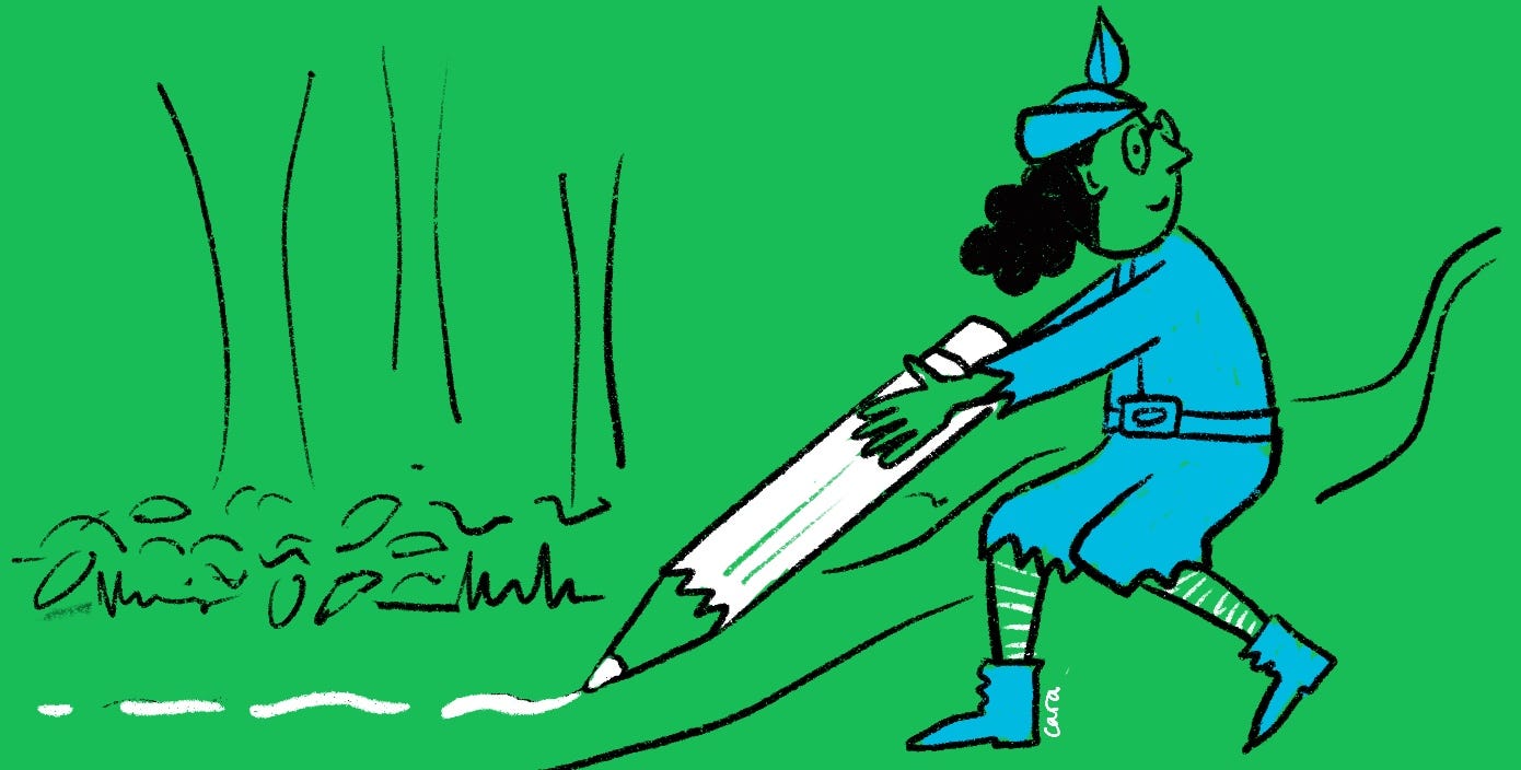
You might be doing it already, gleefully way-finding like a cute wood dwelling sprite in Hobbiton leaving runes on rocks and weaving arrows from feathers. (If this is you then I’d love to know your fave way-finding method).
If though you didn’t get your way-finding badge at brownies, here are some simple steps to help your audience find their way round your graphic recording
1. Arrows and paths
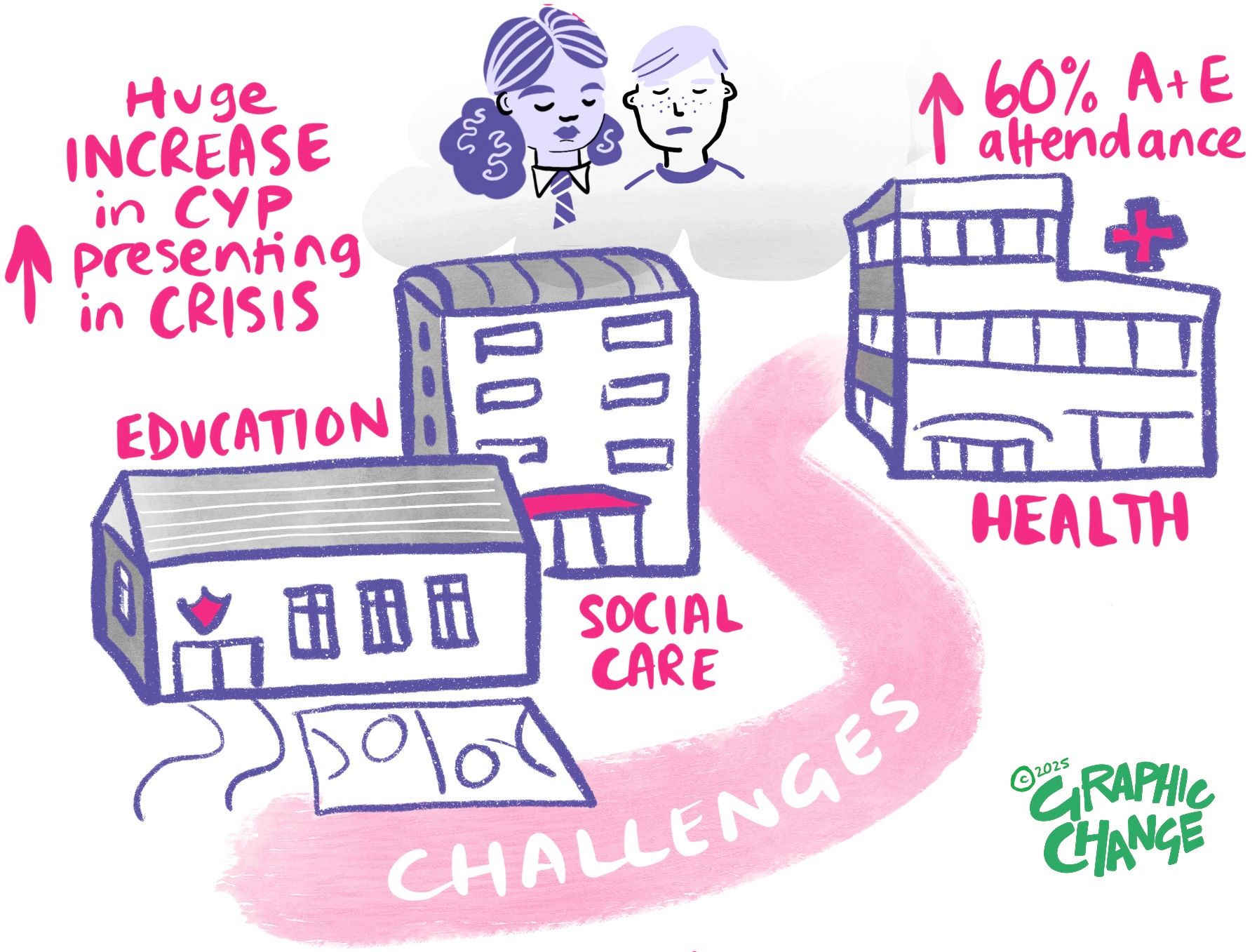
Arrows and paths don’t need introducing. Start here, follow me to here. They are helpful and they are straight forward. Usually.
Where they can go wrong is when they are neither helpful nor straight forward. Multiple arrows all pointing in different directions, or a path that splits into 3 and takes you on a loopy tour of the page only to end up in a dead end…aaaaghh.
This type of navigation is one you can do without, positively unhelpful it will confuse and distract your frustrated audience.
A good arrow or path is worth it’s weight in pen ink though. Personally I’m a fan of a short occasional arrow, or a long background path, subtle but clear in where it’s taking you.
2. Signposts
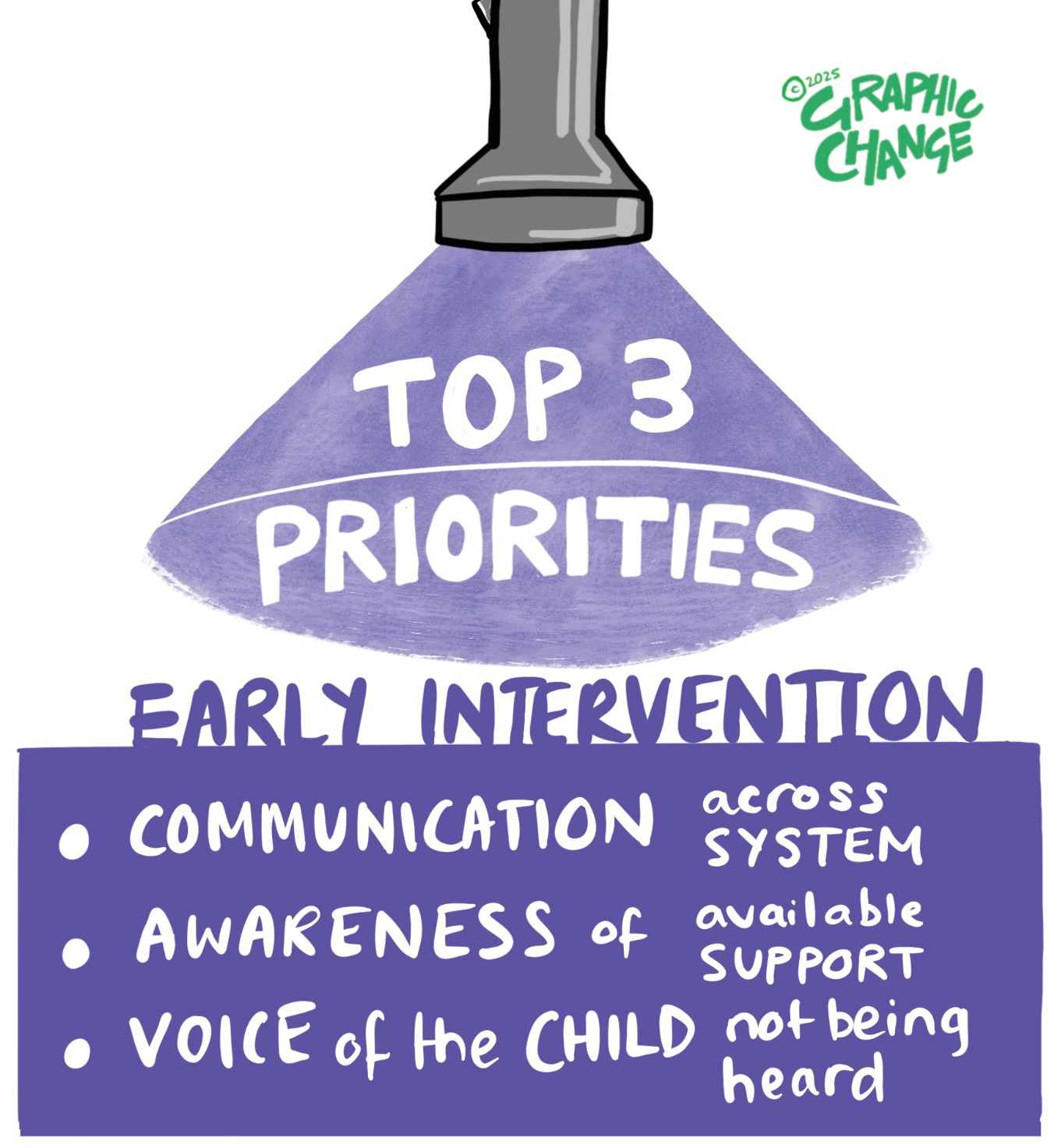
I do like an actual LOOK THIS WAY signpost, some kind of visual that clearly shows the audience what direction to look in in.
Sometimes signposts aren’t that explicit but they’re still super helpful. My favourite is using a SUBTITLE to act as my signpost.
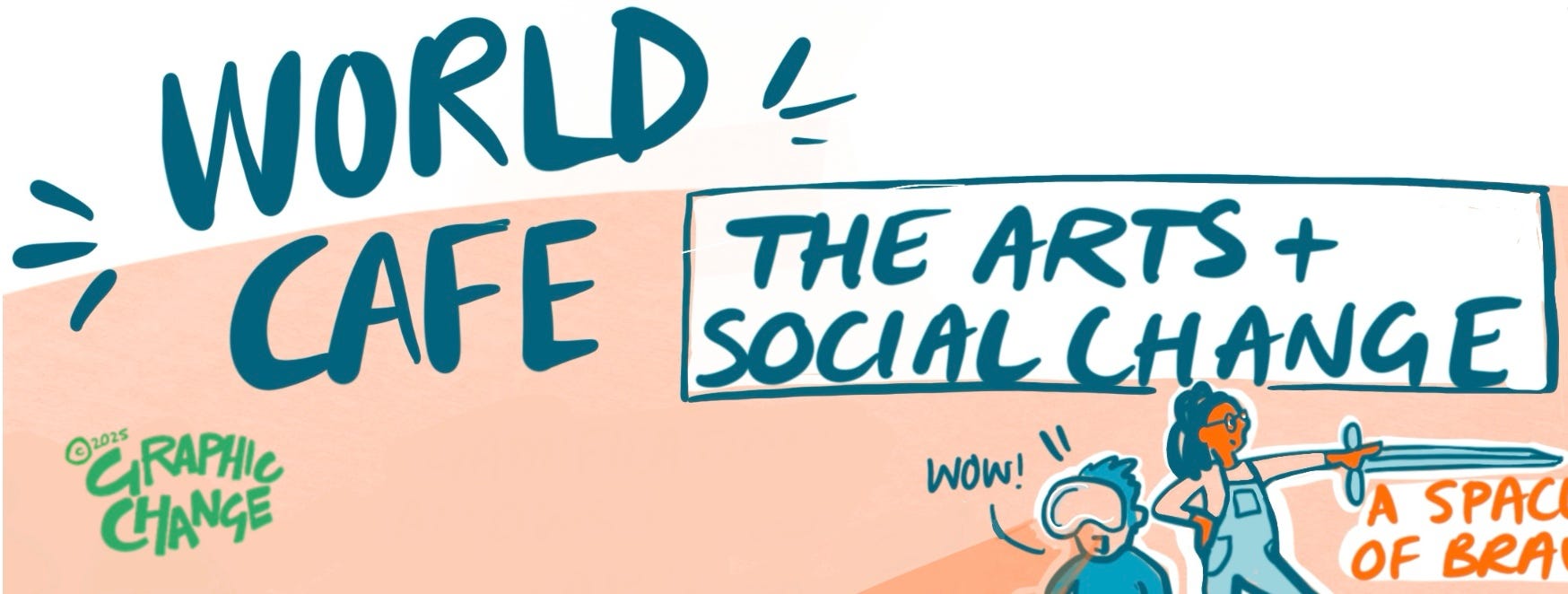
Subtitles catch your attention:
· Different font to main body text - perhaps it’s larger, in a fancy font or captialised
· Underlined, or highlighted to draw your attention
· Perhaps the text is a colour, or it’s underscored or contained with a vivid pop to contrast with the text
They act like stepping stones to your viewers eye allowing them to skip across the page in an orderly fashion.
3. Numbers
Numbers are the bossy friend of the signpost. Where signposts show you the way and invite you to follow along, numbers aren’t there to be negotiated with. Numbers have a set order and you best be following correctly or don’t come moaning to me if you get lost. It’s your all your own fault!
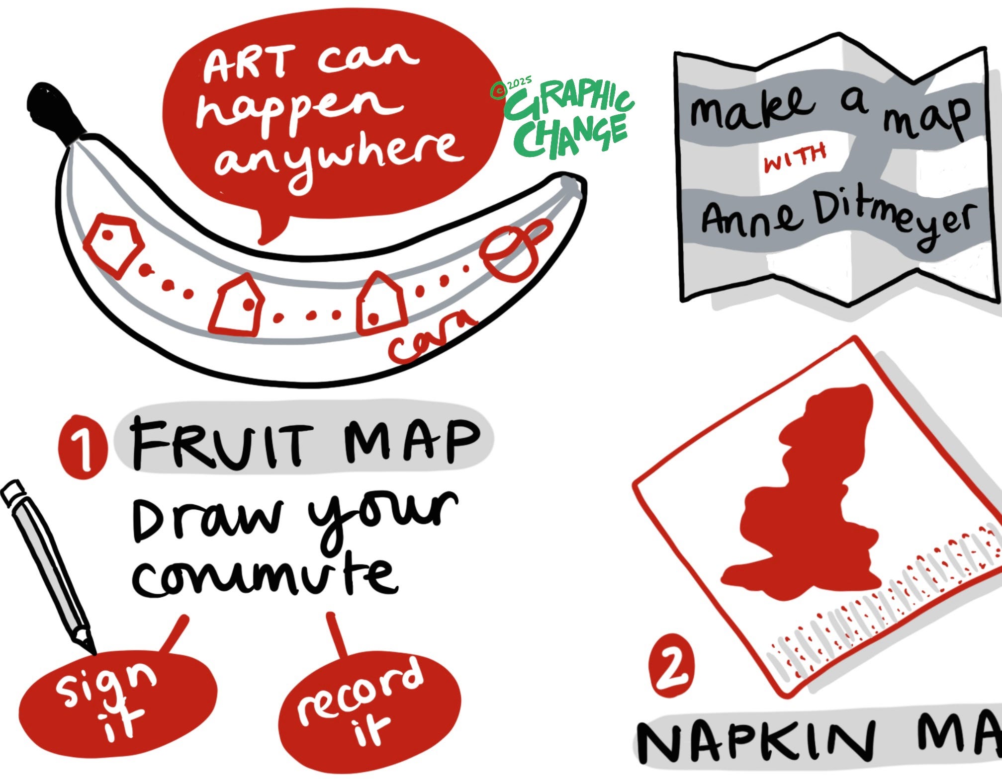
If you’re going to be strict then you’d better make sure you’ve done your part. Your numbers need to be clear and easy to find. If you put no.1 on the top left of your page and then hide no.2 behind a metaphoric curtain over on the opposite side of the page then you’ve not played your part.
Make the order logical, the numbers bold and ideally highlight them in some way to make it virtually impossible to not be able to follow along.
4. Markers
Less explicit than a signpost, less shouty than a number, a marker is more of a serving suggestion. A little flashing light, or a beep like you get when the washing machine has finished. “Look, I’m here! Come on over”
A marker is a bullet point. If you’re going to use them then be consistent. A marker is not the same as a mark, I mean it is, but if all your marks are different then how is someone supposed to know you’re using your marks as markers!?
So, be consistent, use the same shape, colour, size of mark across the page and your audience will notice. They’ll look for the next, nearest one and you’ll have achieved your goal of gently but subtly helping your audience navigate the content.
There are more navigation tools of course but the ones above will service you well and be helpful often.
So my nimble wood dweller, sprinkle those breadcrumbs, lay those paths and leave those signs confident that back down the path people will be following.

New Year intentions
I’m old enough to know that New Years Resolutions don’t really work for me, or for most people; I do though like to ponder the year ahead with my happy glasses on, where deadlines and admin and tax returns can briefly be ignored, and instead imagine how I’d like things to be.
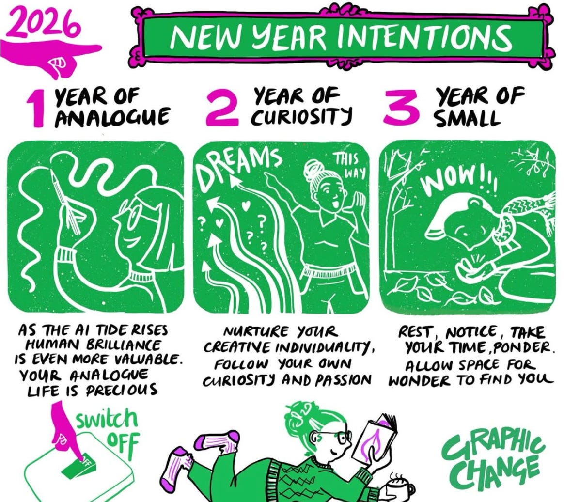
Do you have any intentions for the year ahead?
Annual Pen Check
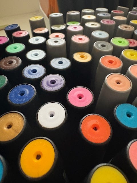
At lease once a year I try and do a bit of a stock take, going through my resources and checking that everything is working and the equipment I regularly use is in good order. The biggest part of that task is checking my pens, and it will be no surprise to you to know that pens run out, dry up, leak and get lost!
One of the reasons I use Neuland pens in my work is that they are refillable. Over the years this has saved me a small fortune, and the planet a lot of single use plastic pens that have to be thrown out once they are empty. If you haven’t refilled a pen before then it can feel a bit daunting. So, here’s the quick photo guide to getting it done.
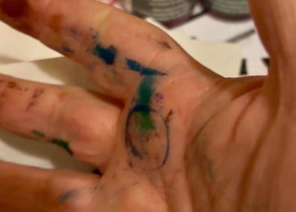
Warning: this can be a bit messy so don’t wear a good top, or do it on top of a cream carpet!
Gather your pens. Go through your draws and work bags gathering everything into one place.
Test each pen on a scrap of paper. I aim to have good ink flow and top up even if the flow is just a little bit dry.
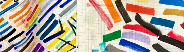
You’ll now have a pile of pens that need topping up or refilling. Find the corresponding ink pot for each colour. With Neuland pens theres a handy no. on the side of each pen so you can double check you’re refilling with the correct shade of ink.
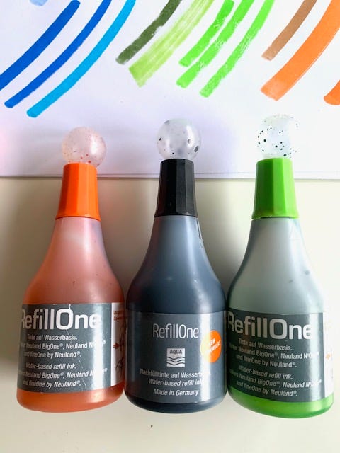
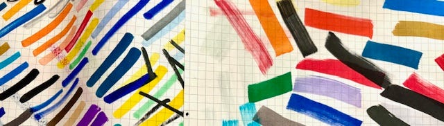
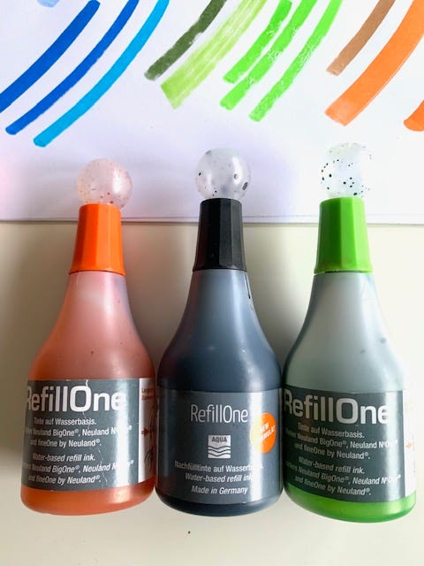
When I started buying Neuland pens I quickly found some favourite colours that I used on a LOT of jobs. I made sure to buy these pens in different sizes (a regular ArtMarker and the BigOne) along with the corresponding ink refill.
I also bought spare nibs so that when the nibs of the pens get frayed and worn out they can be replaced too.
You will notice that at the bottom of each pen is a small hole. This is where ink will go in.
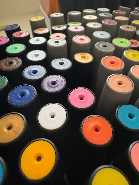
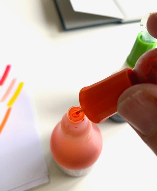
5. Now with the cap of your ink done up tightly, tip the ink bottle upside down and squeeze the pipette at the end of the nozzle to fill it with ink.
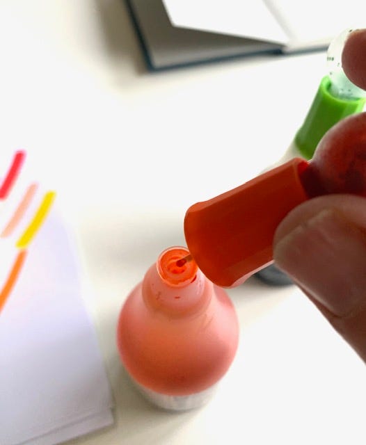
6. Take the lid off your pen when you’re refilling, then insert the nozzle into the hole at the end of the pen and squeeze in the ink.
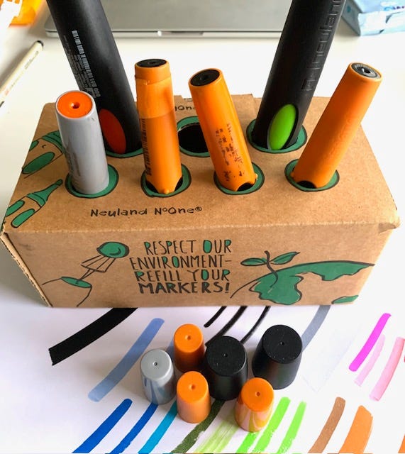
7. Prop your pen somewhere safe to let the ink soak down to the nib. For a really dry pen, or one of the bigger pens you might need more than one squeeze of ink to make the difference.
Neuland does sell a handy pen holder which is perfect for for keeping your pens upright while you’re refilling, or you can make your own.
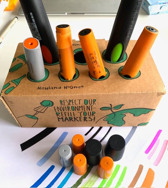
8. After a few minutes retest the pen and if the pen ink is now flowing nicely you can cap your pen and put it away.
Easy, albeit a teeny tiny bit messy.
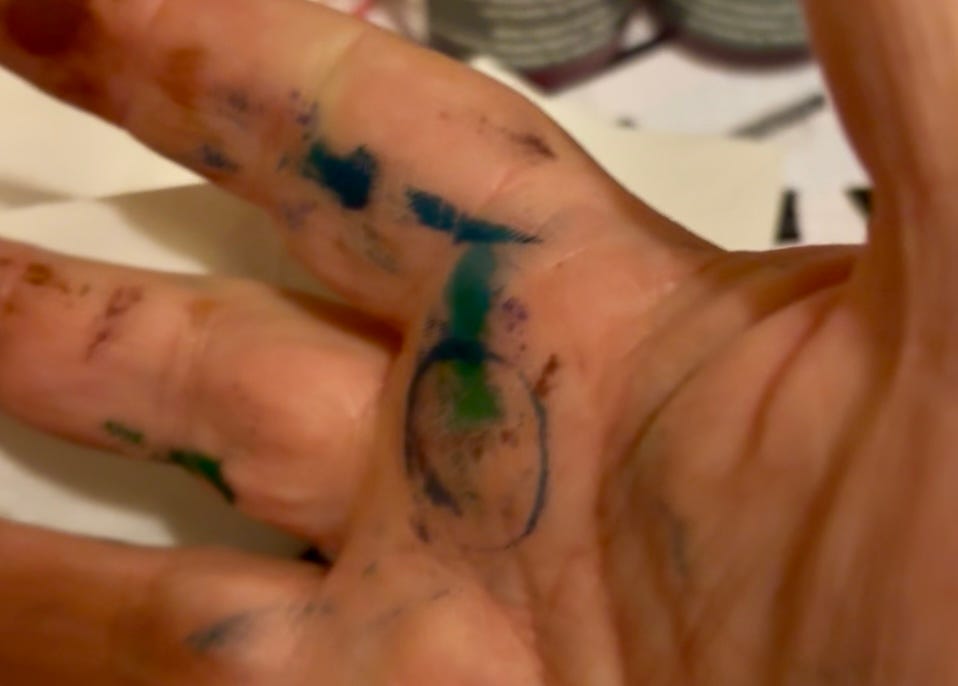
Even if you’re not using refillable pens it’s still worth doing the annual pen check. There’s nothing worse than a pen running out mid job and this way you’ll have a good sense of which pens you’re using the most of, which you need to replace or get a spare of and which ones you could perhaps live without.
We built a Visual Dictionary app in 5 days!
Well I use the royal we - I mean me, Natasha. I built a working mobile-enabled Visual Dictionary app that captures your hand-drawn images, or visual inspiration you see on the go, and files them (compressed) into simple library categories for future work.
The most interesting bit? I was an IT project manager so I do have a lot of passive knowledge but I’m definitely not a coder, so I worked with Claude Code and in 5 days I had a fully user tested app that we can use through a browser or our iPhone, iPad and Android phone!
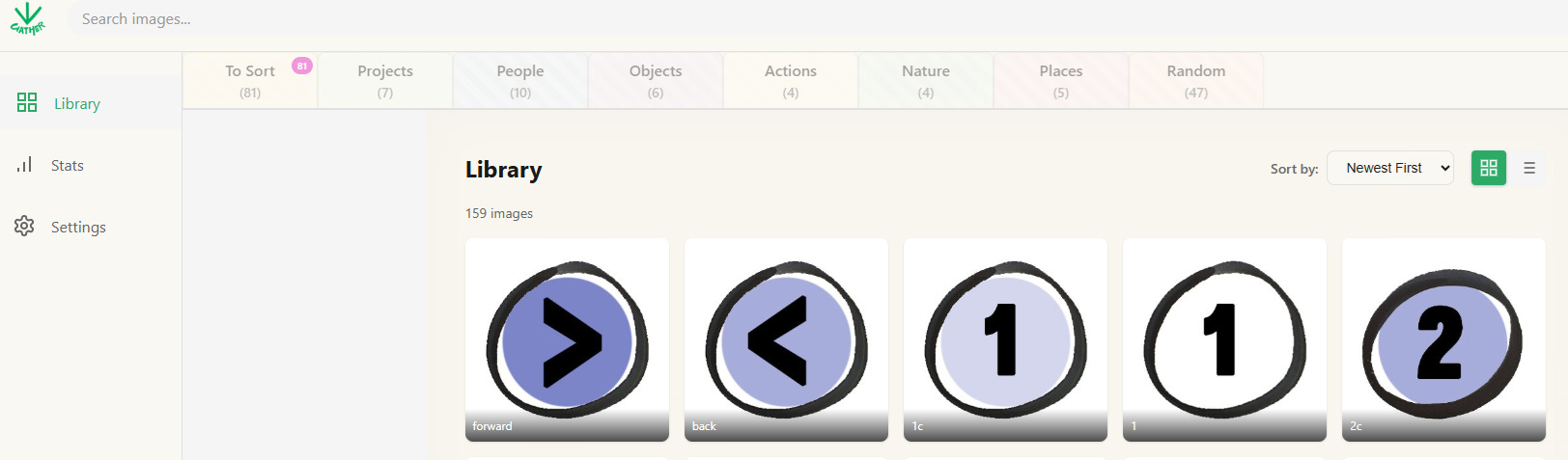
To be clear, I’m sceptical and alarmed by many Ai developments on a global and a business level. I don’t need Ai to write emails to humans for me, and I am furious with the wholesale theft and regurgitation of human artistry in all forms. But coding seems to me to be an appropriate use of Ai - computers talking to computers (what could go wrong?).
This felt like a glimpse into the future, where non-techie people can do some interesting things with an Ai helper? What are your thoughts?
Bulletin board
If you have any relevant visual thinking news you’d like us to share, email Natasha at support@graphicchange.com
We’re gearing up for the new term of our deep dive courses Be a Graphic Recorder and Be a Graphic Facilitator. If you’ve been on the fence about joining here is a little heads up: the price will go up when we open the doors, but if you book your place now you will be able to take advantage of the Early Bird offer and get your place at last year’s price. Register your interest to access the Early Bird price!
It’s world sketch-note week and if you are an educator you’ll find Graphic Change Academy graduate Emily Bryson is giving a free session called: Visual Thinking Tips, Tricks and Tools for The Engaged Classroom. Follow this link to find out more.
Right that’s it for this month.

If you’re enjoying The Visual Edit then you can help support us by doing these two simple things:
Tap the LIKE button
Share with a visual thinking friend
You can also:
Find out more about our courses at the Graphic Change Academy
Join the graphic recorder club here
Buy my book Draw a Better Business
If you enjoy this newsletter, I’d really appreciate you sharing and recommending this publication to your network and visual thinking friends.
Such a fun read. I’ve scheduled my annual pen test next month, woohoo. Also: congrats on building the app Natasha! I look forward to it 😍 And I totally agree with you on the AI sizzle…🫣 Keep rocking it lovelies. 💚